%20(9).webp)
Brand consistency refers to the coordinated application of a brand’s identity, messaging, tone, and visual elements across all customer touchpoints. It addresses a common challenge in marketing: without alignment, brands risk creating fragmented experiences that weaken recognition and trust. By maintaining consistency across channels, organizations ensure that audiences encounter a unified and dependable presence, reinforcing familiarity and credibility over time.
The examples highlighted throughout this piece demonstrate how diverse organizations apply this principle in practice, from visual design systems to tone of voice and customer experience. Whether through minimalist aesthetics, playful messaging, or values-driven storytelling, each brand shows that consistency is less about a single style and more about sustained coherence across every interaction.
The heart of brand consistency is the message, and plays a huge role in that. In this post, dive into what branding consistency is, its importance, benefits, and 15 businesses that have done a stellar job showing it.
Table of Contents
- TL;DR: Brand consistency builds trust.
- What is branding consistency?
- The Importance of Branding Consistency
- Branding Consistency: 15 Brand Examples
- Frequently Asked Questions About Brand Consistency
- Build better branding consistency.
TL;DR: Brand consistency builds trust.
Brand consistency is the practice of presenting the same identity, messaging, tone, and customer experience across every channel so customers recognize, trust, and remember the business. Brand consistency builds trust, credibility, and recognition, leading to businesses meeting customer expectations with a visible, unified identity.
What is branding consistency?
Brand consistency helps businesses present the same identity, messaging, and tone across every customer touchpoint. It should shape every part of marketing, including:
- Logos
- Images
- Copy
- Brand guidelines
Marketing teams use brand guidelines to keep every channel aligned with the brand’s core values.
The Importance of Branding Consistency
Brand consistency builds trust, strengthens credibility, and helps customers recognize a business across channels. Marketing teams reinforce that trust when they repeat the same message over time and across customer touchpoints. After all, customers are putting their trust in a business, and like any relationship, the foundation should be dependable and consistent.
So, not only is this concept important in business strategy, but the benefits speak for themselves.
Benefits of Brand Consistency
Maintain customer expectations.
When creating marketing content, marketing teams can share collateral that delivers the same visual cues from logo, color, and tone that won’t negatively impact customer perception. This standardization of branding lets customers know exactly what to expect every time they come across a business.
Align separate business units.
In creating a uniform brand identity, business teams create varying forms of content across departments that still ring true to clearly specified brand guidelines. While each team won’t be working on the same projects directly, the brand’s story will still shine through.
Establish a more visible, uniform identity.
Brands that are consistently presented are more likely to experience brand awareness and visibility. Consistent presentation often shows up through:
- Recognizable logos, like the Nike swoosh.
- Signature visual devices, like Adidas’ stripes.
- Repeated design cues that help customers identify a brand quickly.
Now that we’ve gone through the importance and benefits of branding consistency, let’s look at some brands that have used it successfully.
Branding Consistency: 15 Brand Examples
1. GymIt
Fitness centers can be intimidating to the average person. GymIt gets it, and takes the intimidation out of the equation by talking to its clientele like real people. The Boston-based gym calls itself “hassle-free” and keeps working out simple.
One of the brand’s slogans is “Get In, Work Out” — clean, to-the-point, and clever. To prove that GymIt doesn’t cater to protein-shake, bodybuilder types, its marketing doesn’t take itself too seriously, either. Below are some snapshots of GymIt’s playful copy across social media, merchandise, and an unintimidating website.

2. Dropbox
The cloud-based file sharing platform, Dropbox, is great at consistent design and personalization across channels.
Users won’t find any Dropbox communication or platforms without its signature open, blue box logo nearby. This style is behind all of the brand’s designs, whether it’s a sleek homepage or a creative error page. Dropbox’s email marketing aligns with that fun, artsy messaging. See the screenshot below of some colorful collateral found across.

3. charity:water
This organization donates 100% of its donations to building water wells in Africa where women and children use yellow jerry cans to carry water back to their villages. charity:water’s logo is a stylized jerry can and not only keeps the branding present across channels, but keeps the issue the charity is helping solve top of mind, as well.
While many traditional nonprofits stick to old-school marketing tactics, charity:water recognizes that in order to inspire people to support a cause, they need to have inspired marketing. The organization’s birthday campaign has attracted supporters in fashion which charity:water uses to show how nonprofits can be trendy. This brand consistency makes it a leader in reinventing nonprofit marketing.

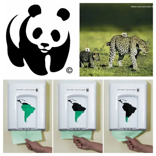
4. World Wildlife Fund
This organization fights for a great cause with great marketing. The WWF’s style and imagery create a mood across channels that forces people to reflect for a moment on how we treat our wildlife and ecosystems.
Below are three examples of how the brand communicates that same strong message in creative, thought-provoking ways. Its logo, print ad, and interactive piece all have a darkness to them through suggestive messaging or tone because of how serious the issue is.
5. Lush
The international handmade cosmetics company, Lush, believes in “making effective products from fresh organic fruits and vegetables,” and in “happy people making happy soap.” Lush stores, products, packaging, and employees (top right) all tell that story.
Lush’s commitment to natural, organic ingredients is aligned with how it presents the brand in-store and on packaging. That consistency shows up in a few clear ways:
- Soaps, powders, and shampoos are displayed in raw form in-store.
- Minimal packaging reinforces the brand’s natural feel.
- Packaged products highlight ingredients and encourage recycling.
- Labels include the face and name of the employee who packed the product.
Every piece of marketing collateral at Lush keeps that same personal, no-frills approach.

6. Boloco
Boston-based burrito company, Boloco, pays attention to consistency in detail in its online and offline marketing. The brand’s slogan is ‘inspired burritos’ and its menus, flyers, napkins, events, website, and other collateral all have a playful, hand-made touch that suggests the business is fueled by more than tortillas and guacamole. Boloco partnered with Life is Good by making a yummy Life is Good burrito with 50 cents of each purchase donated to the company’s charity, Life is Good Playmakers; this partnership fits with Boloco’s inspired brand perfectly.
Boloco keeps branding present by using a playful signature font. No matter the marketing channel, we go loco for Boloco’s consistency.

7. Museum of Fine Arts Boston
Boston’s Museum of Fine Arts promotes its brand throughout the city and under its own roof with such finesse in execution that the brand’s presence is always incredibly recognizable, yet still subtle. All MFA Boston marketing assets are easy to connect to the source.
The MFA keeps its branding simple but strong across every touchpoint. Its consistency is easy to spot in:
- A two-tone color palette used across collateral.
- Red as the museum’s signature color.
- Minimalist design on employee aprons.
- Matching design choices on outdoor banners, the website, and brochures.

8. Intercom
Intercom is a web-based customer service platform. “Treating customers with respect will always be good for business,” the brand says. “And we believe that making customers jump through hoops to try to get help is incredibly disrespectful.” Looking at Intercom’s various forms of communication and marketing tactics, it’s visually apparent how much it doesn’t want its customers to “jump through hoops.”
The brand presents information in a clear, comprehensive way by using imagery instead of written explanations. After all, a picture says a thousand words. Intercom introduces its company with photos other content with simple graphic design. Enticing me with visuals definitely takes hoops out of the equation.

9. Innocent Drinks
Innocent Drinks is a playful smoothie and juice brand from England that keeps its innocent reputation strong with marketing that will make customers feel like a kid again. The meta description reads: “hello, we’re innocent and we’re here to make it easy for people to do themselves some good (whilst making it taste nice too).” How cute is that?
Below are examples of more lovable approaches to branding like its Facebook game (top left), product images (bottom left), and inventive website navigation for the brand’s annual event, Fruitstock. Innocent Drinks stays true to its personality in its tone and creative execution.

10. Zendesk
Zendesk is a cloud-based customer service software system that has built a charming brand through sleek, bright design. The “zen” in this company’s branding can be seen through its mellow yellow and natural color palette.
It’s important to communicate a consistent brand image to the world, but Zendesk recognizes that consistency comes from within as well. Its office carries the theme to keep the feeling strong within company walls. The brand’s signature green is used consistently across channels and complements the brand’s identity.

11. Lululemon Athletica
Sportswear brands often promise that their products will make you a better athlete, but the process and hard work it takes to get there is sometimes forgotten. Lululemon Athletica, a yoga and sportswear brand, keeps the act of working out alive across its assets. The brand hosts free yoga classes in its stores, as well as public outdoor classes.
Its confirmation email (top left) for joining its mailing list is a large image of a woman doing yoga, and the brand’s X profile (top right) displays yoga mats waiting to be rolled out. The brand designs yoga clothing and gear, so why skip to the gratification of doing it when you can cultivate a feeling around the process?

12. ZocDoc
ZocDoc is an online service for finding and booking appointments with physicians in customers’ area. The brand aims to improve access to healthcare, and it communicates the ease of the process with cartoon mascots across all of its marketing communication channels.
After all, cartoons make us feel like kids again, and boy, were things easy when we were kids. See ZocDoc’s charming collateral on the website’s personal account page.

Frequently Asked Questions About Brand Consistency
What is the 3-7-27 rule in branding?
The 3-7-27 rule is a brand messaging framework that helps teams keep communication consistent by focusing on three core messages, repeating them across seven touchpoints, and reinforcing them over time so audiences remember them. While frameworks vary by source, the core idea is repetition and consistency across channels.
How do you ensure brand consistency across channels?
Marketers ensure brand consistency across channels by using clear brand guidelines, aligning teams on voice and visuals, and regularly reviewing content across their website, email, social media, sales materials, and customer service touchpoints. The goal is to make a brand feel recognizable everywhere a customer interacts with it.
What do you mean by brand consistency?
Brand consistency means presenting the same brand identity, messaging, tone, and customer experience across every channel and interaction. It helps people recognize a brand and know what to expect from it.
What is an example of brand consistency?
An example of brand consistency is a company using the same logo, colors, tone of voice, and brand message across its website, social media, email marketing, and in-person experiences. In this article, brands like Dropbox, Lush, and Zendesk show how that consistency works in practice.
What’s the difference between brand consistency and brand identity?
Brand identity is the collection of elements that define a brand, such as its logo, colors, voice, and values. Brand consistency is how reliably marketers apply those elements across channels and over time.
Build better branding consistency.
A lot of these brands use playful, creative, and conversational tones, while others prefer more serious, thought-provoking approaches. Whatever your brand’s tone, keep it consistent across every channel so customers know what to expect. 黑料吃瓜网 helps marketing teams manage brand-consistent content across campaigns, channels, and customer touchpoints.

Free Brand Building Guide
A comprehensive guide to effectively define, launch, scale, and monitor your brand.
- Understanding brands today.
- Incorporating brand in marketing.
- Creating brand strategy.
- Measuring brand impact.
Download Free
All fields are required.
Form not available
You're all set!
Click this link to access this resource at any time.
Branding


![How Internal Marketing Helps You Build a Strong Brand From the Inside Out [Experts Weigh In]](https://53.fs1.hubspotusercontent-na1.net/hubfs/53/internal-marketing-1-20241126-7031360.webp)