A well-built landing page can drive a single conversion action, whether it’s a lead capture or a direct purchase. Knowing how to create a landing page in HTML and CSS gives teams full control over structure, layout, and the elements that guide the user journey.
Unbounce’s 2025 landing page benchmark data puts the median landing page conversion rate across industries at , based on Q4 2024 data. But page clarity, mobile responsiveness, and load speed still determine how well a specific page performs.
This guide walks through creating a responsive landing page in HTML and CSS, and explains best practices, templates, and no-code alternatives to help teams launch faster. For teams who want to move faster without writing code, includes drag-and-drop landing page tools, templates, forms, and built-in conversion features.
Table of Contents
- Why build a landing page in HTML and CSS?
- Skills and Tools You’ll Need to Build an HTML & CSS Landing Page
- HTML Landing Page Best Practices
- How to Create a Landing Page in HTML and CSS
- CSS and HTML Landing Page Templates
Why build a landing page in HTML and CSS?
Landing pages built in HTML and CSS offer a lightweight, fully customizable foundation to build from scratch. Unlike page builders, which bundle additional scripts and UI overhead, HTML and CSS landing pages render only the code defined, giving developers precise control over performance and behavior.
That level of control comes with a trade-off. Writing HTML and CSS takes time and requires some familiarity with how layouts and styles work. For teams working on tight timelines or without development experience, no-code builders like offer a faster path to launch, with pre-built templates that teams can customize to match their brand.
I’ve worked on landing pages built both ways. Builders are easier to start with and work well for most standard campaigns. Once the fundamentals are in place, HTML and CSS offer a level of creative and performance control that is harder to adjust inside a template.
Skills and Tools You’ll Need to Build an HTML & CSS Landing Page
Building a landing page in HTML and CSS does not require deep front-end expertise, but it does need a working understanding of core web fundamentals and a few tools to write, test, and refine the code. Most people overestimate the number of skills required, and most of them can be picked up quickly through practice.
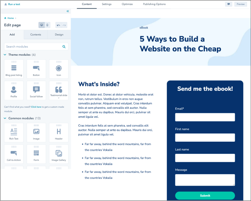
Free Landing Page Builder
Create and test beautiful landing pages that generate leads and look great on any device.
- Build landing pages.
- Turn visitors into leads.
- Optimize for SEO.
- And more!
Required Knowledge
These fundamentals cover how a landing page is structured, styled, and adapted across devices. Before starting, get comfortable with:
HTML Basics
HTML defines the structure of the page. A landing page typically uses semantic HTML5 elements, such as <header>, <main>, <section>, <form>, and <footer>, which define what each part is and where it sits in the page. Semantic HTML5 elements improve accessibility by providing clear signals to screen readers and assistive technologies about page structure and content hierarchy.
CSS Fundamentals
CSS controls how the page looks, including colors, typography, spacing, and layout. A basic understanding of selectors, classes, and styling rules is enough to start building and customizing sections.
Layout Systems (Flexbox)
Flexbox aligns elements in a single direction (rows or columns). In this build, Flexbox is used to position navigation items, space feature cards, and center elements on the page.
Responsive Design Basics
A landing page needs to work across devices. Responsive design adapts layouts to different screen sizes using flexible units and media queries.
These skills are helpful for more advanced projects, but this build doesn’t require them:
- CSS Grid is great for two-dimensional layouts that require simultaneous control over both rows and columns.
- CSS clamp() allows font sizes to scale smoothly across screen sizes
- CSS combinators and pseudo-elements: Combinators and pseudo-elements help target more specific design patterns without adding extra HTML.
- Lightweight JavaScript is used for mobile navigation toggle and scroll behavior.
For hands-on practice with HTML and CSS before starting, these beginner HTML projects cover the same foundational skills used throughout this tutorial.
Tools You’ll Need
This build requires only free tools available across all major operating systems.
Code Editor
Visual Studio Code (VS Code) is the recommended code editor for this tutorial. It has one of the largest extension libraries available and strikes a good balance between simplicity and capability, which makes it suitable for both beginners and experienced developers.
Web Browser
A modern web browser, such as Google Chrome or Mozilla Firefox, is essential for testing the landing page at every stage. Checking the layout in at least two browsers is useful, as small rendering differences can appear between engines.
Browser DevTools
Most browsers have built-in developer tools for inspecting, editing, and debugging a live page. In Chrome, DevTools opens with Ctrl+Shift+I on Windows or Cmd+Option+I on Mac. The device toolbar (Ctrl+Shift+M / Cmd+Shift+M) simulates mobile viewports directly in the browser, making it the fastest way to check responsive behavior.
Pro tip: Install the Live Server extension (by Ritwick Dey) in VS Code before starting the build. It refreshes the browser automatically on every save and also acts as a local server when developers add JavaScript later.
HTML Landing Page Best Practices
A landing page performs best when every element and headline guides visitors toward a single conversion. The fewer decisions a visitor has to make, the easier it is to follow through on that action.
1. Place the key action above the fold.
Above the fold is the most valuable real estate on a landing page. Every visitor decides whether to stay or leave based on the first screen they see. Ideally, the first screen needs to answer three things immediately:
- What the offer is.
- Who it is for.
- What action to take.
The CTA button should be visible without scrolling on both desktop and mobile.
2. Limit navigation.
Navigation is useful on multi-page or homepage websites, but on a landing page, it introduces alternative paths. Removing the header navigation entirely, or reducing it to a logo-only option, keeps visitors’ focus on the conversion goal. The footer should remain minimal, with only legal links and essential information.
3. Keep the page clean.
A clean layout improves readability and makes it easier for visitors to process information.
Use whitespace effectively, and maintain a clear section hierarchy. Curate images for maximum impact, not volume, and limit body copy to what is strictly necessary.
4. Optimize for speed and mobile.
Page speed directly affects how users experience the page. A 11-second delay in website speed and page load time can reduce conversions by .
Optimize to keep the HTML and CSS lightweight, use compressed assets, and aim for load times under 3 seconds.
5. Test, then iterate.
A published landing page is a starting point, not a finished product. A/B test different versions of the headline, CTA copy, button color, and layout to understand what drives conversions for a specific audience. Record results and iterate based on data.
Directional cues can help guide attention toward the CTA. On lead generation pages I’ve worked on, visual cues such as arrows or image composition made the CTA easier to notice, even when the overall lift was subtle.
How to Create a Landing Page in HTML and CSS
In this tutorial, I’ll walk through building a free-trial lead-capture landing page using HTML and CSS. The finished page follows the same structure that applies to most landing pages:
- Navigation bar keeps branding visible and links to the primary CTA.
- Hero section introduces the offer and primary CTA above the fold.
- Features section supports the decision with three key benefits.
- Form captures the lead with a name and email field.
- Footer closes the page with legal links only.
For those working with HTML and CSS for the first time, spending a few hours on the basics before starting the tutorial will make each step easier to follow.
The 黑料吃瓜网 HTML guide covers the tags and syntax used throughout this tutorial. For a broader picture of how HTML and CSS work together, this “How to code a website guide” is a good starting point.
If visual learning works better than reading, this from freeCodeCamp covers the same ground in about two hours.
Step 1: Set up your file structure.
A landing page built in HTML and CSS consists of three files: an HTML file for structure, a CSS file for styling, and an optional JavaScript file for interactive elements, such as a mobile navigation toggle.
I start by setting up a clean folder in VS Code before writing any code. Create a new folder called “landing-page” and add these files:
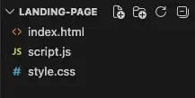
Open index.html and type !, then press Tab. This command is a VS Code shortcut to generate the base HTML structure instantly.
If it doesn’t work, paste the following:
<!DOCTYPE html>
<html lang=”en”>
<head>
<meta charset=”UTF-8”>
<meta name=”viewport” content=”width=device-width, initial-scale=1.0”>
<title>Start Your Free 黑料吃瓜网 Trial</title>
<link rel=”stylesheet” href=”style.css”>
</head>
<body>
</body>
</html>
Here is what each line does:
- <!DOCTYPE html> declares the document as HTML5, so the browser knows how to parse it.
- <html lang=”en”>: sets the language for accessibility and SEO.
- <head> contains metadata and links to external resources.
- <meta charset=”UTF-8”> sets the text encoding so that special characters and symbols display correctly, such as é, ?, and ?.
- <meta name=”viewport”> controls how the page scales on mobile devices. Without this tag, the browser renders the page at a fixed desktop width regardless of screen size, and responsive CSS will have no effect.
- <link rel=”stylesheet”> connects the CSS file to the HTML.
- <body> is where all visible content goes.
At this point, the page will appear empty in the browser. The structure is in place, and the next steps will start adding visible sections.
Pro tip: Before moving forward, make sure the <meta name=”viewport”> tag is present in the <head>. If it is missing, the responsive CSS won’t work on mobile.
Free Landing Page Builder
Create and test beautiful landing pages that generate leads and look great on any device.
- Build landing pages.
- Turn visitors into leads.
- Optimize for SEO.
- And more!
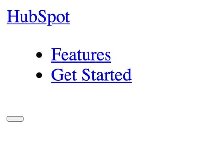
Step 2: Build the navigation.
Navigation on a landing page is deliberately minimal. Its role is to anchor the page and keep the primary CTA accessible as visitors scroll.
For this build, the navigation includes a logo, one anchor link, and a CTA that points directly to the form.
Inside the <body>, add:
<header class=”site-header”>
<nav class=”navbar” aria-label=”Main navigation”>
<a href=”#” class=”nav-logo”>黑料吃瓜网</a>
<ul class=”nav-links”>
<li><a href=”#features”>Features</a></li>
<li><a href=”#form”>Get Started</a></li>
</ul>
<button class=”nav-toggle” aria-expanded=”false” aria-controls=”nav-links”>
<span class=”hamburger”></span>
</button>
</nav>
</header>
The <header> marks the top section of the page, and <nav> groups all navigation-related links.
I’m using semantic tags here instead of a <div> stack so the structure stays clear as more sections get added. Inside <nav>, the logo is a simple anchor link, and a <ul> groups the navigation items, the standard way to organize links.
The toggle button includes aria-expanded and aria-controls attributes for the mobile menu. The JavaScript for that comes in the optional step later, but I add these attributes now so the structure is already correct by then.
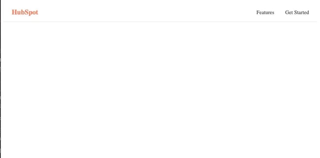
To keep the navigation visible while scrolling, add the following CSS block to style.css:
.site-header {
position: sticky;
top: 0;
z-index: 100;
background-color: #ffffff;
border-bottom: 1px solid #e5e5e5;
}
The position: sticky tag keeps the header fixed at the top, and the z-index ensures it sits above other sections.
Add the remaining styles:
.navbar {
display: flex;
align-items: center;
justify-content: space-between;
max-width: 1100px;
margin: 0 auto;
padding: 1rem 1.5rem;
}
.nav-logo {
font-size: 1.25rem;
font-weight: 700;
color: #ff7a59;
text-decoration: none;
}
.nav-links {
display: flex;
gap: 2rem;
list-style: none;
margin: 0;
padding: 0;
}
.nav-links a {
text-decoration: none;
color: #333333;
font-size: 0.95rem;
}
.nav-toggle {
display: none;
}
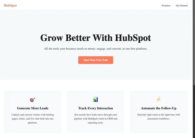
The navigation bar now displays a logo on the left and links on the right, sticking to the top as the page scrolls.
Step 3: Create the hero section.
The hero section carries most of the weight on a landing page. It contains the H1, a supporting subheadline, the primary CTA button, and a product image or illustration.
After the closing </header> tag, add a <main> element with the hero section:
<main>
<section class=”hero”>
<h1>Grow Better With 黑料吃瓜网</h1>
<p class=”hero-sub”>All the tools your team needs to attract visitors, convert leads, and close deals, in one free CRM.</p>
<a href=”#form” class=”btn-primary”>Start Your Free Trial</a>
</section>
</main>
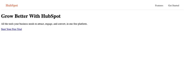
The <main> tag wraps the primary content of the page, and the hero section sits at the top, with an H1, a supporting paragraph, and a CTA.
The anchor link styled as a button points directly to the lead form added in Step 5.
In style.css, add style for the hero section:
.hero {
background-color: #f5f8fa;
padding: 80px 1.5rem;
text-align: center;
}
.hero-content {
max-width: 680px;
margin: 0 auto;
}
.hero h1 {
font-size: clamp(2rem, 5vw, 3rem);
font-weight: 800;
color: #1a1a1a;
margin-bottom: 1rem;
}
.hero-subtext {
font-size: 1.125rem;
color: #555555;
margin-bottom: 2rem;
line-height: 1.6;
}
.btn-primary {
display: inline-block;
background-color: #ff7a59;
color: #ffffff;
padding: 0.875rem 2rem;
border-radius: 4px;
text-decoration: none;
font-weight: 600;
font-size: 1rem;
}
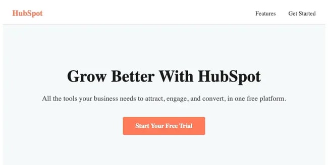
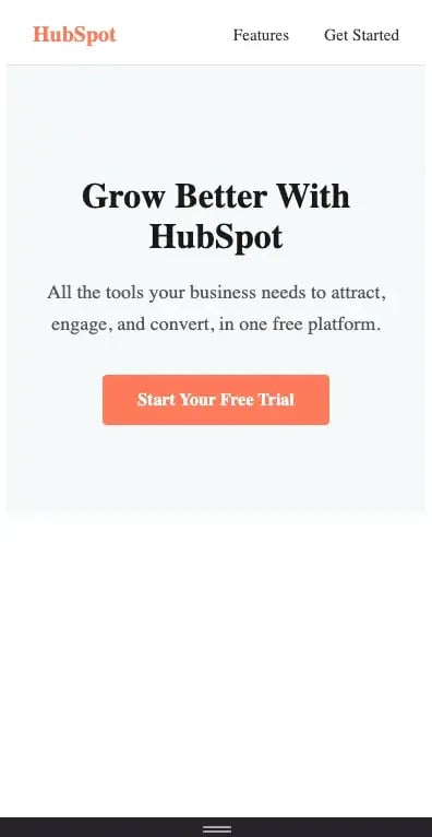
The hero CSS follows a mobile-first approach: base styles target small screens first, while larger screens receive layered enhancements. The layout remains consistent across devices without having to redesign for each size.
For the headline, I’ve used clamp() so the font adjusts automatically across screen sizes.
CSS clamp() scales font sizes automatically between a minimum and maximum value based on viewport width, removing the need for typography-specific media queries.
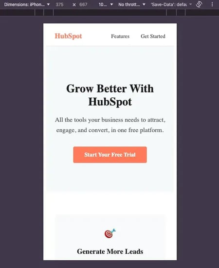
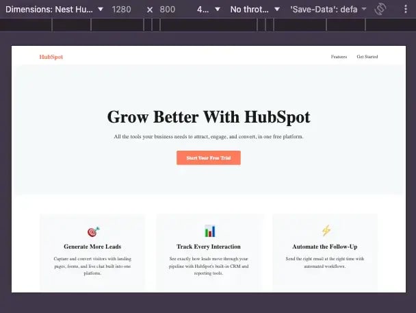
Here is how the styled hero appears on desktop and mobile:
Pro tip: Write the H1 to match what the visitor clicked to get here, whether that was an email, an ad, or a social post. The headline should confirm they are in the right place.
For example, “Download our free marketing guide” works better than “Welcome to our page” if the ad that brought them here promised a free guide.
For inspiration on how top-performing brands design and structure their hero sections, see landing page examples.
Free Landing Page Builder
Create and test beautiful landing pages that generate leads and look great on any device.
- Build landing pages.
- Turn visitors into leads.
- Optimize for SEO.
- And more!
Step 4: Add a features or benefits section.
A features section highlights the product’s or offer’s core benefits in a structured format. Short, scannable points make it easier for visitors to process and evaluate before taking action.
Add the section below the hero section tag:
<section class=”features” id=”features”>
<div class=”features-grid”>
<div class=”feature-card”>
<div class=”feature-icon”>?</div>
<h3>Generate More Leads</h3>
<p>Capture and convert visitors with landing pages, forms, and live chat built into one platform.</p>
</div>
<div class=”feature-card”>
<div class=”feature-icon”>?</div>
<h3>Track Every Interaction</h3>
<p>See exactly how leads move through your pipeline with 黑料吃瓜网’s built-in CRM and reporting tools.</p>
</div>
<div class=”feature-card”>
<div class=”feature-icon”>?</div>
<h3>Automate the Follow-Up</h3>
<p>Send the right email at the right time with automated workflows.</p>
</div>
</div>
</section>
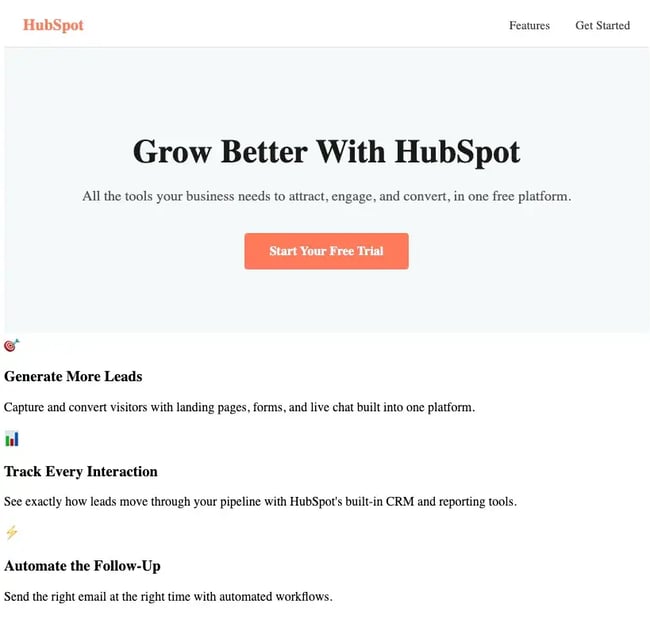
The id=”features” connects the section to the navigation link added in Step 2. Clicking ‘Features’ in the nav bar scrolls directly to this section.
Add styles for features to style.css:
.features {
padding: 4rem 1.5rem;
background-color: #ffffff;
}
.features-grid {
display: flex;
flex-direction: column;
gap: 2rem;
max-width: 1100px;
margin: 0 auto;
}
.feature-card {
background-color: #f8f9fa;
border-radius: 8px;
padding: 2rem;
text-align: center;
}
.feature-icon {
font-size: 2rem;
margin-bottom: 1rem;
}
.feature-card h3 {
font-size: 1.25rem;
font-weight: 700;
color: #1a1a1a;
margin-bottom: 0.75rem;
}
.feature-card p {
font-size: 0.95rem;
color: #555555;
line-height: 1.6;
}
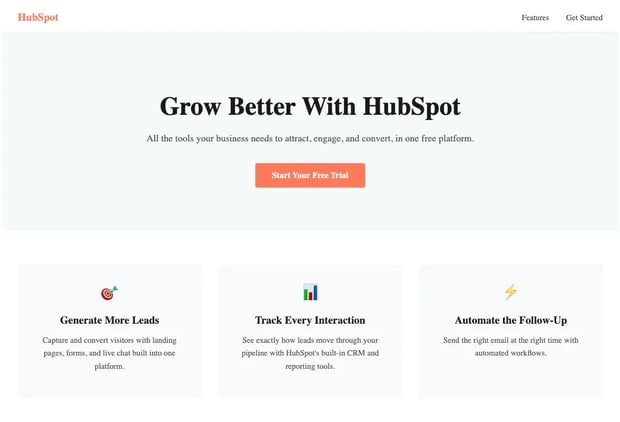
The cards stack vertically by default, keeping the layout readable on smaller screens. To place them side by side on larger screens, add:
@media (min-width: 768px) {
.features-grid {
flex-direction: row;
align-items: stretch;
}
.feature-card {
flex: 1;
}
}
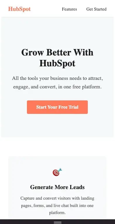
Pro tip: Keep the features section to three or four points. More than four items make the section harder to scan and can increase cognitive load.
Step 5: Build the lead capture form.
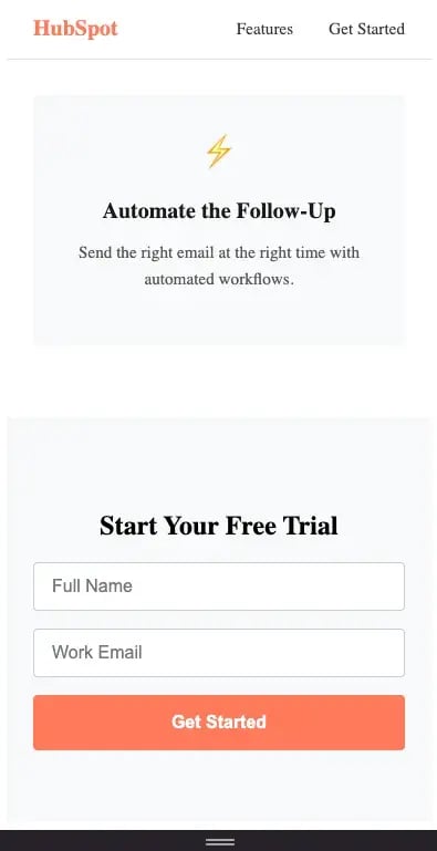
The lead capture form is where the page converts. Everything built so far exists to get the visitor here, so I’ve kept the form as simple as possible with: a name field, an email field, and a submit button.
After the closing features </section>, add this:
<section class=”cta-form” id=”form”>
<div class=”form-container”>
<h2>Start Your Free Trial</h2>
<form action=”#” method=”POST”>
<input type=”text” name=”name” placeholder=”Full Name” required>
<input type=”email” name=”email” placeholder=”Work Email” required>
<button type=”submit” class=”btn-primary”>Get Started</button>
</form>
</div>
</section>
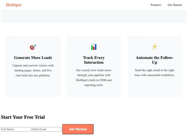
The form element groups all input fields, and each input uses the required attribute to prevent empty submissions, reducing incomplete entries without needing additional setup.
Now add the styles:
.cta-form {
padding: 4rem 1.5rem;
background-color: #f8f9fa;
text-align: center;
}
.form-container {
max-width: 480px;
margin: 0 auto;
}
.cta-form form {
display: flex;
flex-direction: column;
gap: 1rem;
}
.cta-form input {
padding: 0.75rem 1rem;
border: 1px solid #cccccc;
border-radius: 4px;
font-size: 1rem;
}
.cta-form input:focus {
outline: none;
border-color: #ff7a59;
}
.cta-form .btn-primary {
width: 100%;
padding: 1rem;
border: none;
cursor: pointer;
}
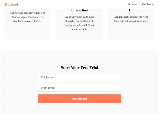
Here is what key styles do here:
- .form-container { max-width: 480px; margin: 0 auto; } centers the form and keeps it narrow so it does not stretch awkwardly on wide screens.
- display: flex; flex-direction: column; stacks the labels, inputs, and button vertically.
- input:focus { border-color: #ff7a59; } replaces the default browser focus ring with the brand orange, keeping the form accessible for keyboard users.
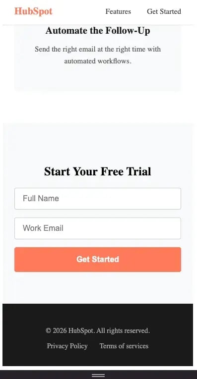
Pro tip: Check the form position on a real mobile device before publishing. Sections stack taller on smaller screens than DevTools simulations show, so the form should be reachable without excessive scrolling.
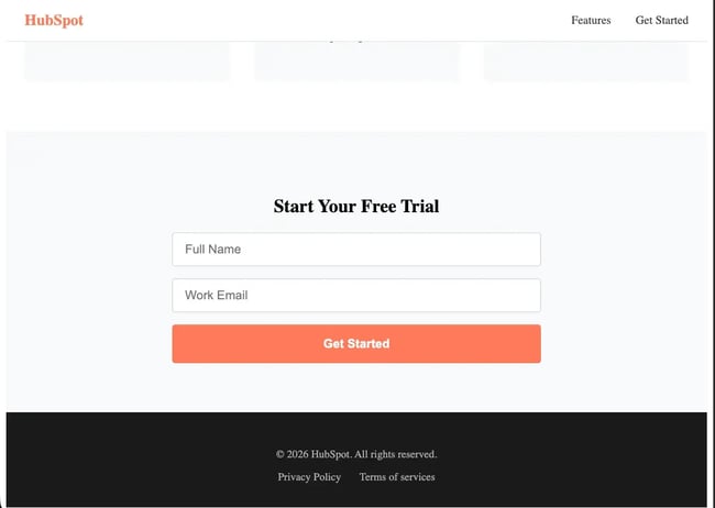
Step 6: Create the footer.
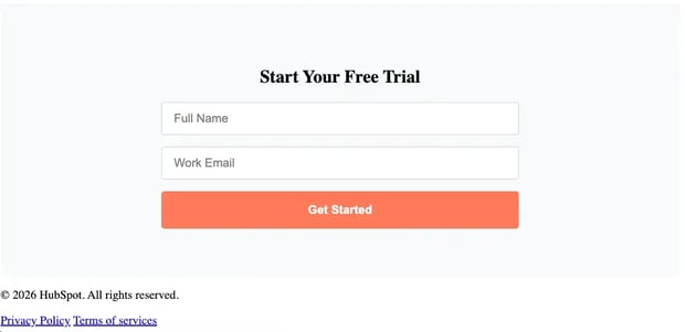
The footer defines the bottom section of the page. It usually includes supplementary information, such as legal links or brand details, that don’t detract from the main goal.
Add below the form section:
<footer class=”site-footer”>
<div class=”footer-container”>
<p>? 2026 黑料吃瓜网. All rights reserved.</p>
<div class=”footer-links”>
<a href=”#”>Privacy Policy</a>
<a href=”#”>Terms of service</a>
</div>
</div>
</footer>
Now add the CSS:
.site-footer {
padding: 2rem 1.5rem;
background-color: #1a1a1a;
color: #aaaaaa;
text-align: center;
font-size: 0.875rem;
}
.footer-links {
display: flex;
justify-content: center;
gap: 1.5rem;
margin-top: 0.75rem;
}
.footer-links a {
color: #aaaaaa;
text-decoration: none;
}
background-color: #1a1a1a gives the footer a dark background to separate it from the form section above, and color: #aaaaaa keeps the text muted.
Pro tip: If brand guidelines require social media links in the footer, add target=”_blank” to open them in a new tab. Adding the target property keeps the landing page session active even if the visitor clicks through to social.
Free Landing Page Builder
Create and test beautiful landing pages that generate leads and look great on any device.
- Build landing pages.
- Turn visitors into leads.
- Optimize for SEO.
- And more!
Step 7: Make it fully responsive.
A responsive landing page adjusts its layout automatically across screen sizes without requiring a separate mobile design. With , and Google using mobile-first indexing for search rankings, responsiveness affects both conversion and organic visibility.
The styles added in previous steps already cover smaller screens. This step adds breakpoints that adjust layout and typography for larger screens.
Add the following to the bottom of style.css:
/* Tablet and up */
@media (min-width: 768px) {
.hero {
padding: 6rem 2rem;
}
.features-grid {
flex-wrap: nowrap;
}
}
/* Desktop */
@media (min-width: 1024px) {
.hero h1 {
font-size: 3.5rem;
}
.form-container {
max-width: 560px;
}
}
These two breakpoints handle the most significant layout shifts: the features section switches from a stacked to a horizontal layout, and the hero typography scales up on larger screens.
To test the responsive behavior, open Chrome DevTools with Cmd + Shift + M on Mac or Ctrl + Shift + M on Windows, then toggle the device toolbar. Test at these widths:
- 375px: iPhone SE, the smallest common viewport
- 390px: iPhone 14
- 768px: tablet portrait
- 1280px: standard desktop
DevTools is useful for quick checks, but layout and spacing can behave differently on real devices. I always do a final test on a physical phone before publishing.
Pro tip: Use relative units, rem, em, %, for font sizes, padding, and widths wherever possible. They scale more naturally across screen sizes and reduce the need for constant overrides.
Step 8 (Optional): Add JavaScript for nav toggle and smooth scroll.
The landing page built in the previous steps is fully functional without JavaScript. The two additions here, a mobile nav toggle and smooth scroll, improve the experience for mobile visitors.
Both are lightweight and do not require any libraries or frameworks.
Open script.js and add the following:
// Nav toggle
const navToggle = document.querySelector(‘.nav-toggle’);
const navLinks = document.querySelector(‘.nav-links’);
navToggle.addEventListener(‘click’, () => {
const isOpen = navLinks.classList.toggle('nav-open');
navToggle.setAttribute('aria-expanded', isOpen);
});
// Smooth scroll
document.querySelectorAll(‘a[href^=”#”]‘).forEach(anchor => {
anchor.addEventListener('click', function (e) {
e.preventDefault();
document.querySelector(this.getAttribute('href'))
.scrollIntoView({ behavior: 'smooth' });
});
});
The first block handles the mobile menu by toggling a class and updating the aria-expanded state. The second block enables smooth scrolling when users click anchor links.
Finally, link the script at the bottom of index.html, just before the closing </body> tag:
<script src=”script.js”></script>
</body>
Placing the script here ensures the HTML loads before the JavaScript runs. If the script executes before the elements exist, the selectors return null, and the interactions won’t work.
Pro tip: For smooth scroll alone, adding “html { scroll-behavior: smooth; }” in style.css achieves the same result without any JavaScript.
CSS and HTML Landing Page Templates
Creating a landing page in HTML and CSS from scratch gives greater control and flexibility overall. However, it is not always the most efficient approach, especially for time-sensitive campaigns or teams that need to launch quickly.
HTML and CSS landing page templates reduce that overhead, with pre-built sections and responsive layouts that teams can adapt to match their brands. These templates stood out for their responsiveness, ease of customization, load performance, and suitability for conversion-focused landing pages.
Here are 10 HTML and CSS landing page templates to get started:
1.
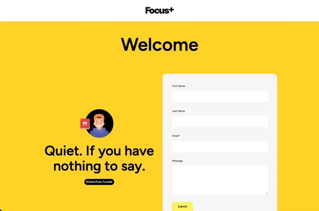
Focus is a 黑料吃瓜网-native landing page template designed for quick setup without coding. The layout uses a single-page structure with a prominent hero section and a form placed alongside it, making the template suitable for capturing leads with minimal configuration.
The bright yellow background is the first thing that stands out. I like how it immediately pulls attention toward the headline and form rather than any decorative element.
The template is also editable directly inside 黑料吃瓜网 so users can update headlines, form fields, and text without changing the layout. Focus also adheres to Content Hub standards, ensuring compatibility with built-in modules and workflows.
Key Features
- Free theme with an upgraded version available
- Built for Content Hub
- No coding required
- Includes documentation and free support
Best for: Personal brands, startups, ecommerce, and small teams
Pricing: Free. Focus Plus is available for a one-time payment of $499.
What we like: Vibrant color theme and an easy-to-customize layout.
2.
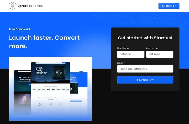
Sprocket Rocket offers a flexible starting point for teams looking for a polished 黑料吃瓜网 page. It emphasizes reusability, so brand colors, fonts, and styles are configured once and carry across every page built with the theme.
The layout follows a clean SaaS-style structure, but what caught my attention more is how the form sits against the blue background. The contrast keeps the form visible without any additional styling.
Key Features
- 30,000+ downloads
- Responsive and fast-loading
- Includes documentation and support
Best for: Startups, growing businesses, and tech teams.
Pricing: Free plan available. Paid plans start at $197 as a one-time payment.
What we like: It works just as well on mobile as it does on desktop. The layout doesn’t feel cramped or stretched.
3.
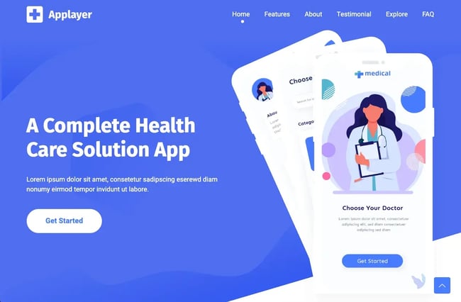
AppLayer is a free HTML landing page template suited for apps or SaaS products preparing for launch. The design has a modern SaaS look with a clean layout and a section-by-section flow.
The framework already maps out everything needed to explain a product, removing the guesswork of deciding what to include and in what order to include it. Because the site uses Bootstrap 5 and a block-based setup, sections can be adjusted or rearranged without hassle.
Key Features
- Built with Bootstrap 5
- Includes hero, features, about, how it works, FAQ, and download sections
- Fully responsive and fast-loading
Best for: Developers, SaaS startups, and digital product teams.
Pricing: Free lite version available for personal use. Paid commercial licenses start at $14.
What we like: The section order follows the natural decision path a visitor takes when evaluating a product. The template is also well-documented, making it easier to work with even when someone sets it up for the first time.
4.

Thrifty is a freemium 黑料吃瓜网 theme designed as a complete starting point for small-business websites and landing pages. There are multiple page types, such as newsletters, call booking, and content downloads, that cover a few common use cases out of the box.
It covers all the expected sections like features, testimonials, and customer proof, with a minimal header. Users can trim down the form section depending on how much information the offer actually needs.
I found it useful because the template helps first-time builders without making the experience feel beginner-level.
Key Features
- Drag-and-drop, no coding required
- Easy customization
Best for: Small businesses and first-time 黑料吃瓜网 users.
Pricing: Free.
What we like: Three purpose-built templates in one theme. Built for first-time builders.
Free Landing Page Builder
Create and test beautiful landing pages that generate leads and look great on any device.
- Build landing pages.
- Turn visitors into leads.
- Optimize for SEO.
- And more!
5.
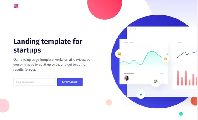
April is a one-page landing page template that lets users customize it for almost any product, service, or campaign. The layout doesn’t try to do too much upfront. There’s space, softer colors, and a more relaxed flow, rather than pushing everything into tight sections.
There are sections for features and testimonials below the fold, which back up the hero claim with context and social proof.
Key Features
- Responsive across all devices
- Includes product preview, features, and testimonial sections
- Ready-made sections with modern illustrations
Best for: Founders, creators, and teams launching simple campaigns
Pricing: Free.
What we like: Feels light and open. The visuals don’t overwhelm the layout.
6.
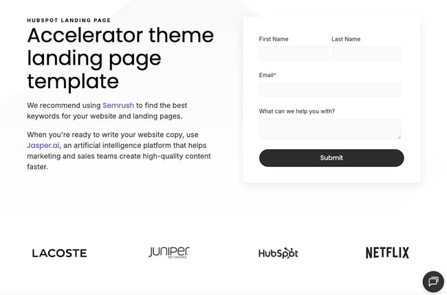
Accelerator is one of the fastest-loading themes on Content Hub. For landing pages where load time directly affects conversion rate, it’s worth paying attention to.
The overall feel is more minimal and modern than that of heavier themes. There’s a lot of open space, and the layout doesn’t feel crowded even with multiple sections.
In my experience, it’s flexible enough to be styled across multiple brands without having to rebuild from scratch each time, making it a practical choice for agencies managing several clients.
Key Features
- Drag-and-drop editing across pages and templates
- Designed for fast page speed (high performance scores)
Best for: Agencies, consultants, and marketing teams working on multiple campaigns.
Pricing: Free.
What we like: Easy to work with when iterating on pages. The layout doesn’t get in the way of content.
7.
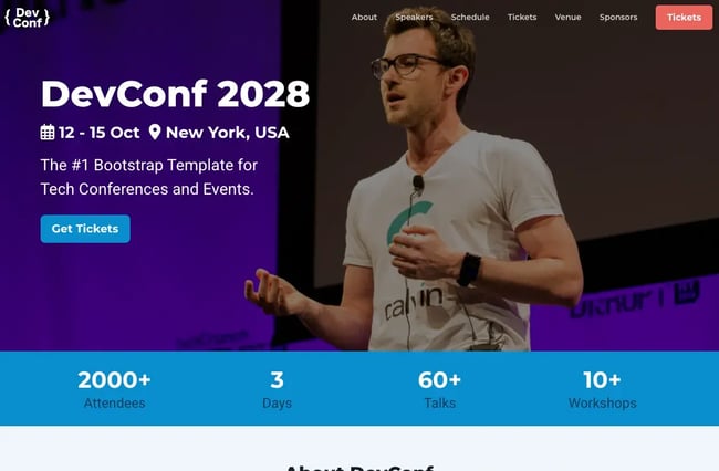
DevConf is the only template in this list specifically for events and conferences. The hero section immediately establishes the event name, date, location, and a single CTA; everything a visitor needs to decide whether to keep reading is visible.
Below the fold, the template covers speakers, schedule, tickets, venue, and sponsors. I found the timeline-style schedule particularly useful since it matches how attendees usually plan their day.
Key Features
- Free with commercial license option
- Built with Bootstrap 5
- Includes speaker, schedule, countdown timer, and ticket sections
- SCSS source files included
Best for: Tech conferences, workshops, events, and ticketed meetups.
Pricing: Free with footer attribution. A commercial license without footer attribution is available for $39.
What we like: The information is easy to scan.
8.
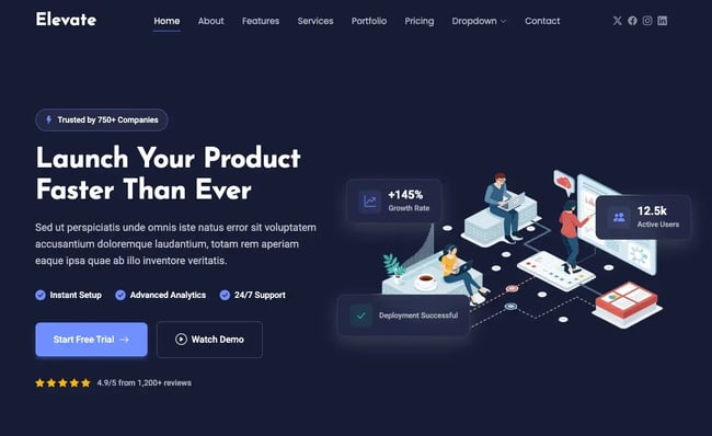
Elevate is a modern landing page template designed for products and services that need a more polished, high-trust presentation. The layout covers everything from features and testimonials to pricing and contact sections in one cohesive flow.
What stood out to me is how the page uses contrast and spacing to guide attention. The darker background, combined with highlighted stats and callouts, adds context as visitors move through the page.
There’s a clear hierarchy without overloading the screen. The structure keeps things focused while still feeling complete.
Key Features
- Built with Bootstrap 5
- Includes stats, testimonials, and pricing blocks
- Clean typography and modern layout
- Responsive design
Best for: Agencies, SaaS companies, and service-led businesses
Pricing: Free.
What we like: The smaller details add depth to the page. The overall feel is more premium than that of typical templates.
9.
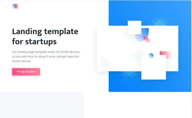
Agnes is a Tailwind CSS landing page template with a clean, minimal design. The template covers all the essential sections for product-focused landing pages, such as a product preview, feature list, and pricing table.
I found the design lightweight and easy to work with. Since the base styling is minimal, customizing it to fit a specific brand doesn’t require undoing much existing code.
Key Features
- Built with Tailwind CSS
- Includes intro area, feature list, and three-tier pricing table
- Clean one-page layout
- Fully responsive
Best for: Startups, SaaS products, and early-stage launches
Pricing: Free.
What we like: The page uses soft shapes and plenty of white space, and doesn’t feel overloaded.
10.
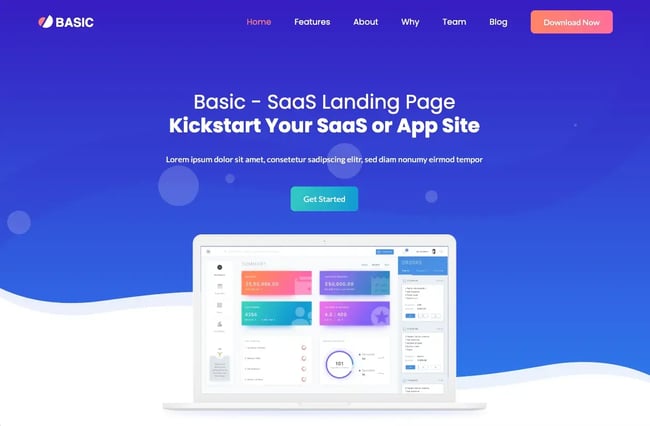
Basic is a simple Bootstrap 4 template for a SaaS or app landing page with all the basics already in place. Its one-page structure covers features, about, team, and blog sections to present a product without building the layout from scratch.
Since it follows a block-based structure, sections can be rearranged or removed without affecting the rest of the page. I like that it includes SASS files, allowing variable-level styling changes.
Key Features
- Built with Bootstrap 4 and HTML5
- Block-based structure with SASS support
- Responsive design
Pricing: Free lite version available. Paid commercial licenses start at $14.
Best for: Startups and teams building quick product landing pages
What we like: The design is simple and easy to follow, and the background animation adds a modern touch.
Templates are one way to speed up the build, but teams that want even faster can skip the build process entirely. Building a landing page with AI covers how to generate a complete, conversion-ready page in a fraction of the time.
Get started with landing page building.
Building a landing page in HTML and CSS gives teams more control over performance, layout, and the structure behind a conversion-focused page. Even a simple build shows how much outcomes can depend on small decisions, such as headline placement, form length, mobile spacing, and load time.
That foundation also makes it easier to customize a template, troubleshoot a layout, or evaluate why a page is not converting.
For teams that need to move faster or manage multiple campaigns,Content Hub offers drag-and-drop landing page tools, templates, and customer data connected through 黑料吃瓜网 Smart CRM.
Editor's note: This post was originally published in March 2020 and has been updated for comprehensiveness.
Free Landing Page Builder
Create and test beautiful landing pages that generate leads and look great on any device.
- Build landing pages.
- Turn visitors into leads.
- Optimize for SEO.
- And more!
Landing Page Design